 GraceFully
Food Delivery, Made Simple for Seniors
GraceFully is a speculative project: a food-delivery app made for seniors. Most delivery apps are crowded with deals, pop-ups and tiny buttons, and I wanted to see what one would look like if it was built for someone who doesn’t use their phone much. I designed the brand first (the logo, colours and type), then designed the app in Figma, going from paper sketches to a prototype you can click through.
Problem statement
How might we make ordering food easy for seniors who aren’t comfortable with technology?
Challenges & Solutions
Challenge
Too much going on. Most delivery apps are full of deals, banners and small buttons.
Solution
Each screen has one main thing to do, and the buttons are big.
Challenge
Small, light grey text is hard to read, especially for older eyes.
Solution
Bigger, darker text, plus a setting to make it even bigger.
Challenge
Getting lost at checkout. The longer the checkout, the easier it is to get stuck halfway.
Solution
Checkout is three steps, and the app tells you clearly when your order is placed.
Process
Branding & moodboard
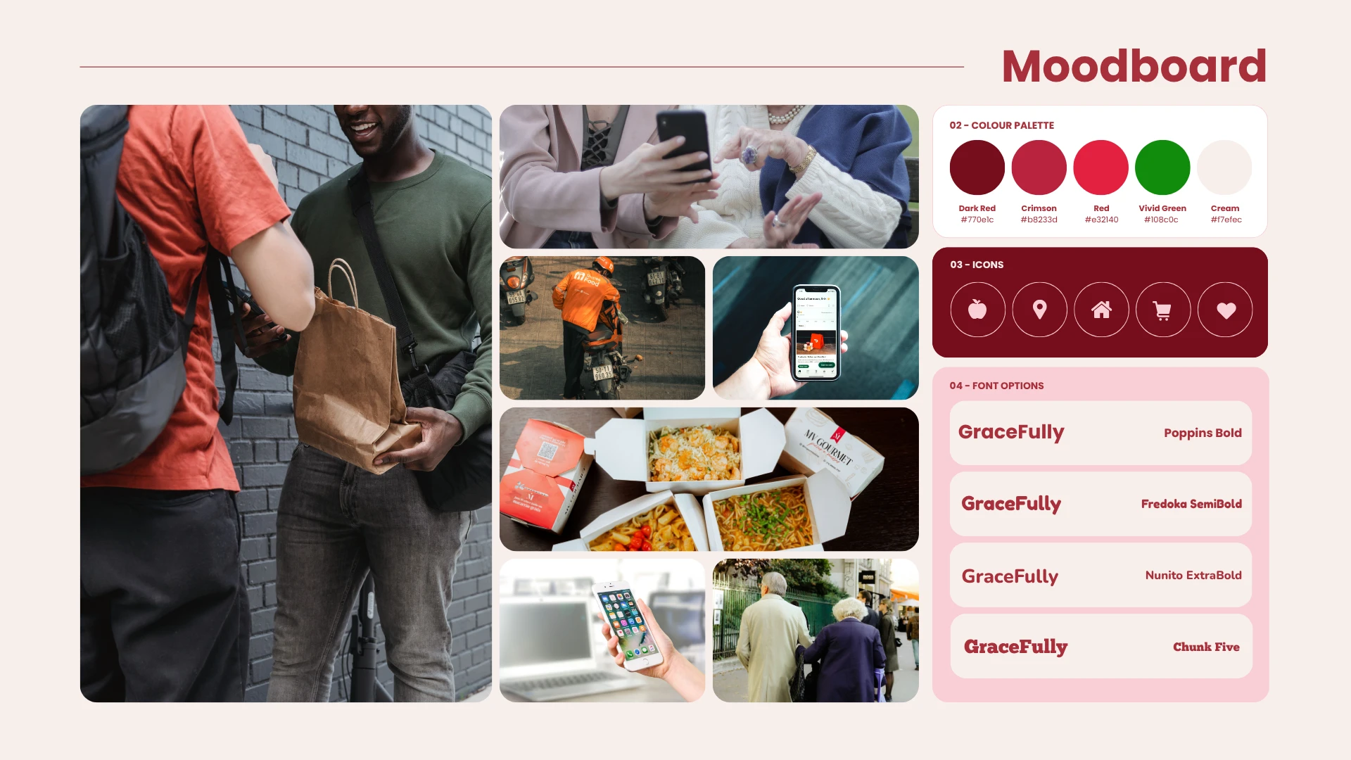
I gathered photos, colours, icons and fonts to figure out the feel I wanted: warm and friendly, not clinical.
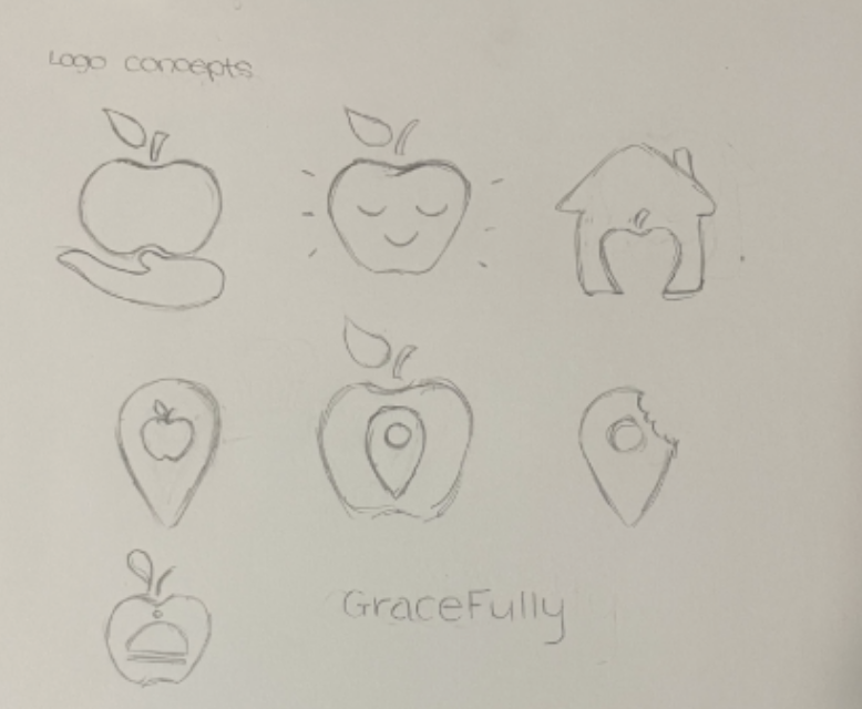
Logo brainstorming
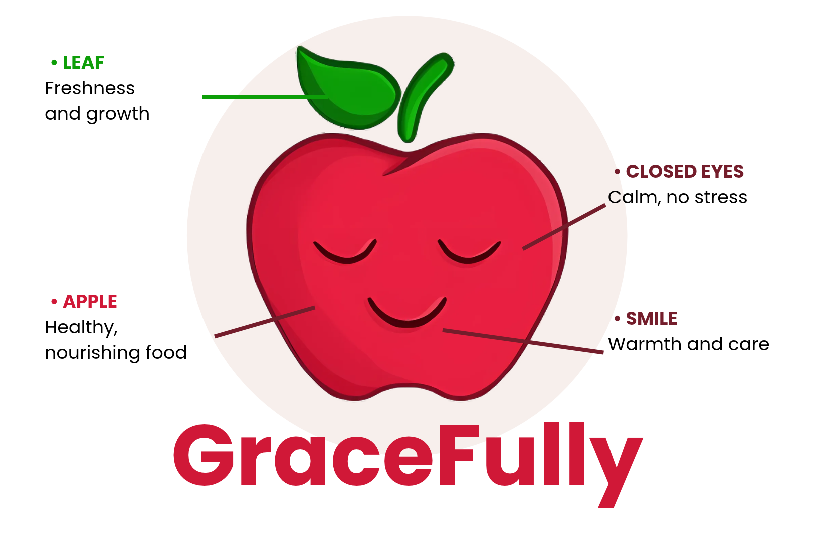
I sketched a bunch of ideas (an apple in a hand, an apple in a house, location pins) before landing on the sleepy, smiling apple.
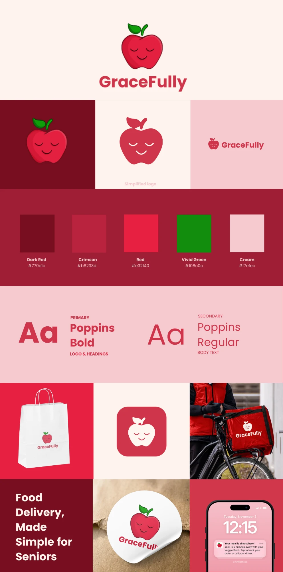
Creating the brand identity
The logo, colours and Poppins type all on one board, with a few mockups to see how it looks on a bag, a box and a phone.
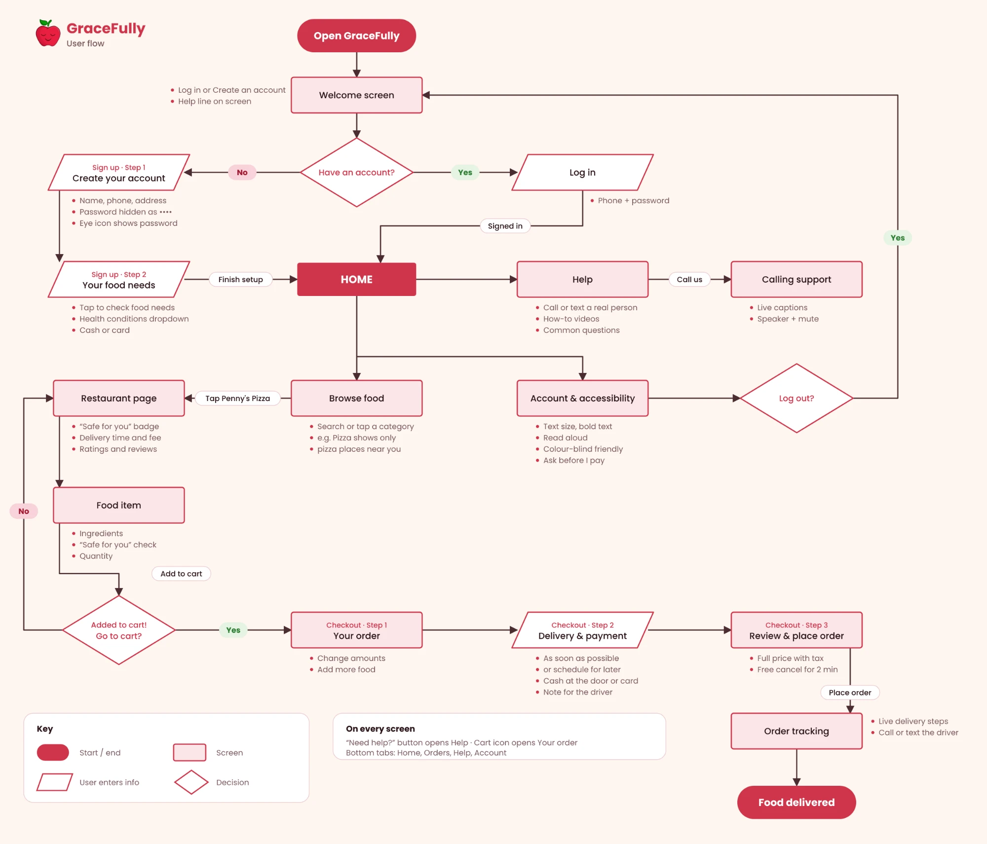
User flow diagram
I mapped out every step from opening the app to getting your food, so I could keep the path as short as possible.
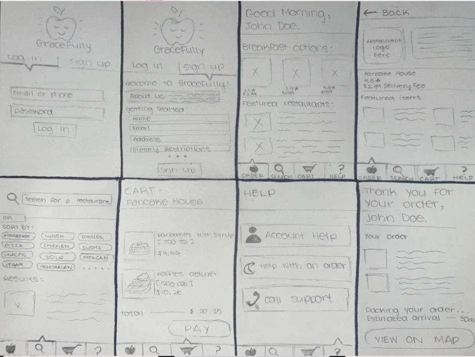
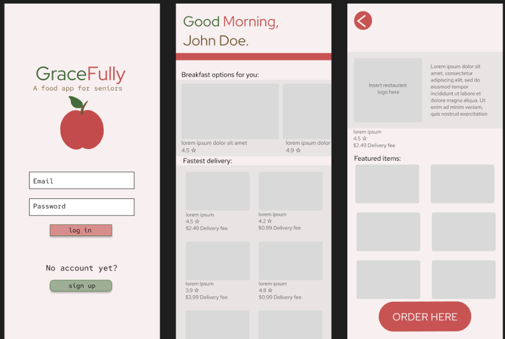
Low-fidelity screens
Quick paper sketches to work out the layout, button sizes and what goes where.
Mid-fidelity screens
I moved the sketches into Figma and tried out colour and type before adding real photos.
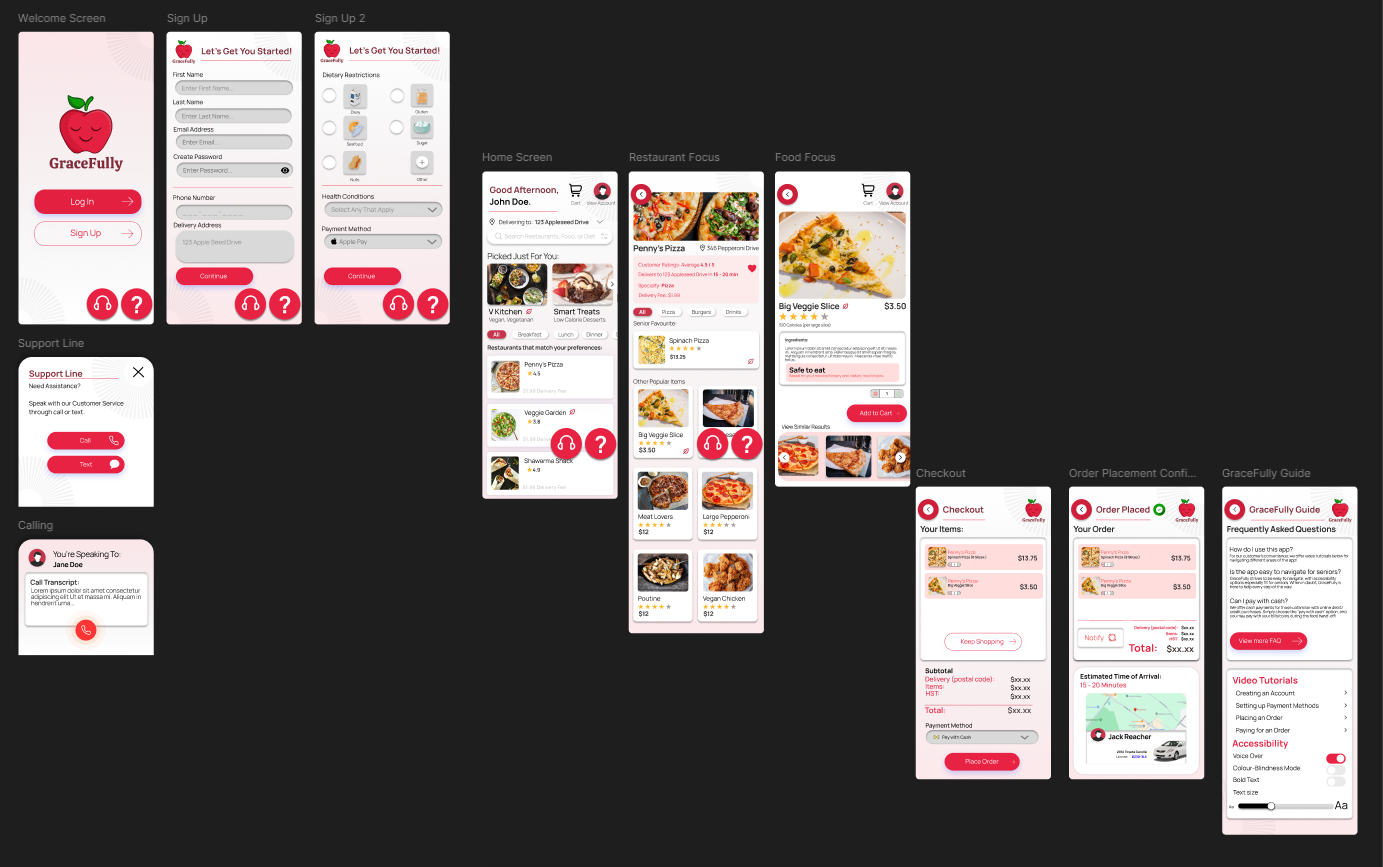
High-fidelity screens (version 1)
The first full-colour version, linked up in Figma so you can click through it.
 View Figma prototype
Result
Introducing…
Food Delivery, Made Simple for Seniors
Logo
Logo in action
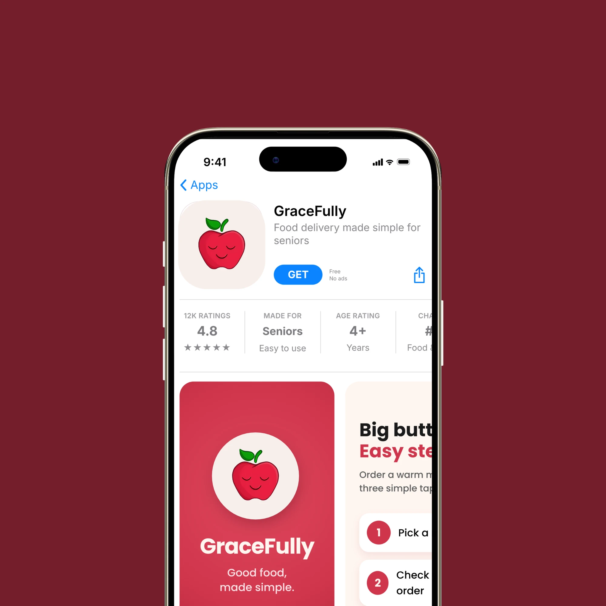
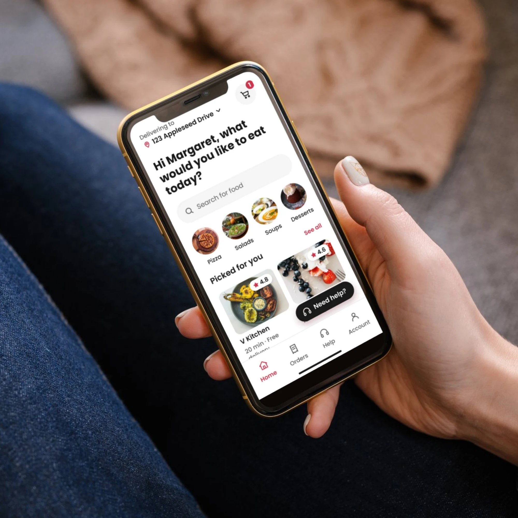
Brand in use
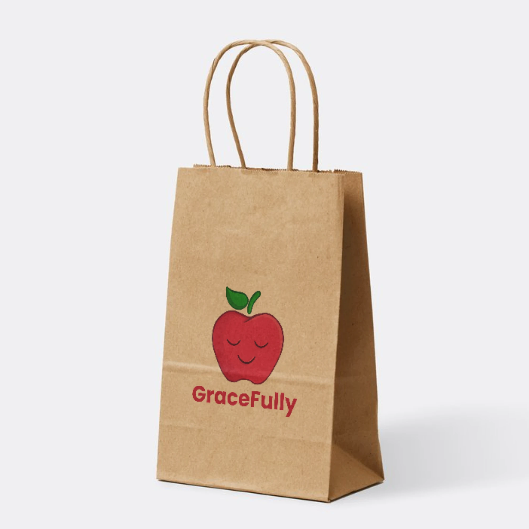
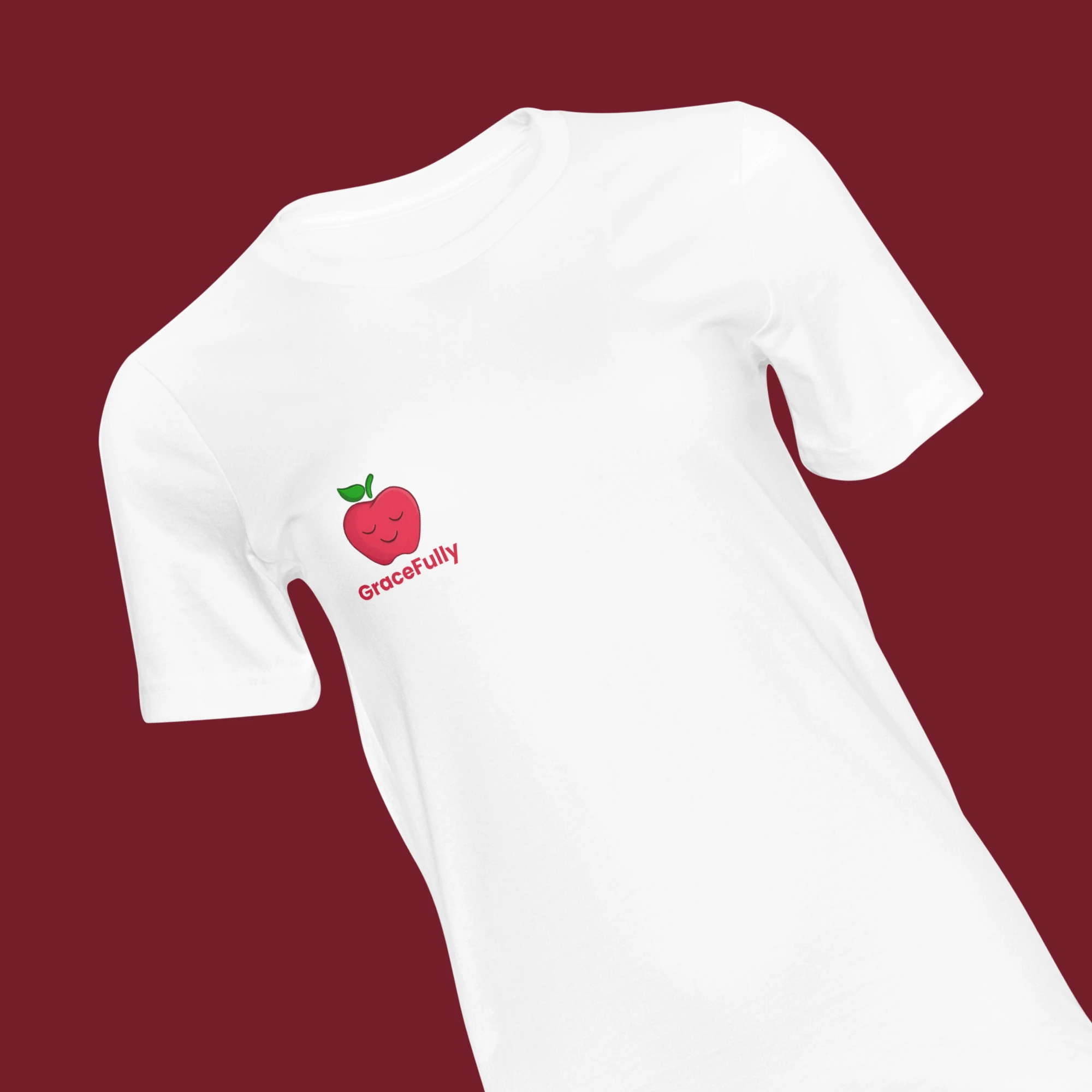
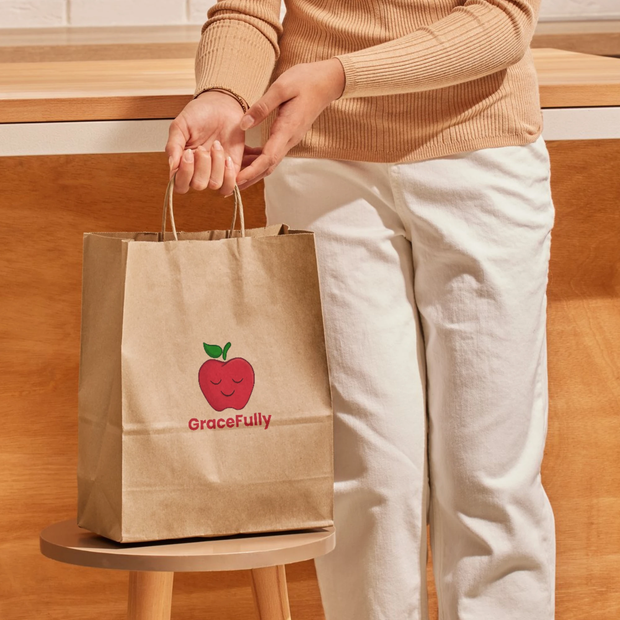
Campaign & marketing
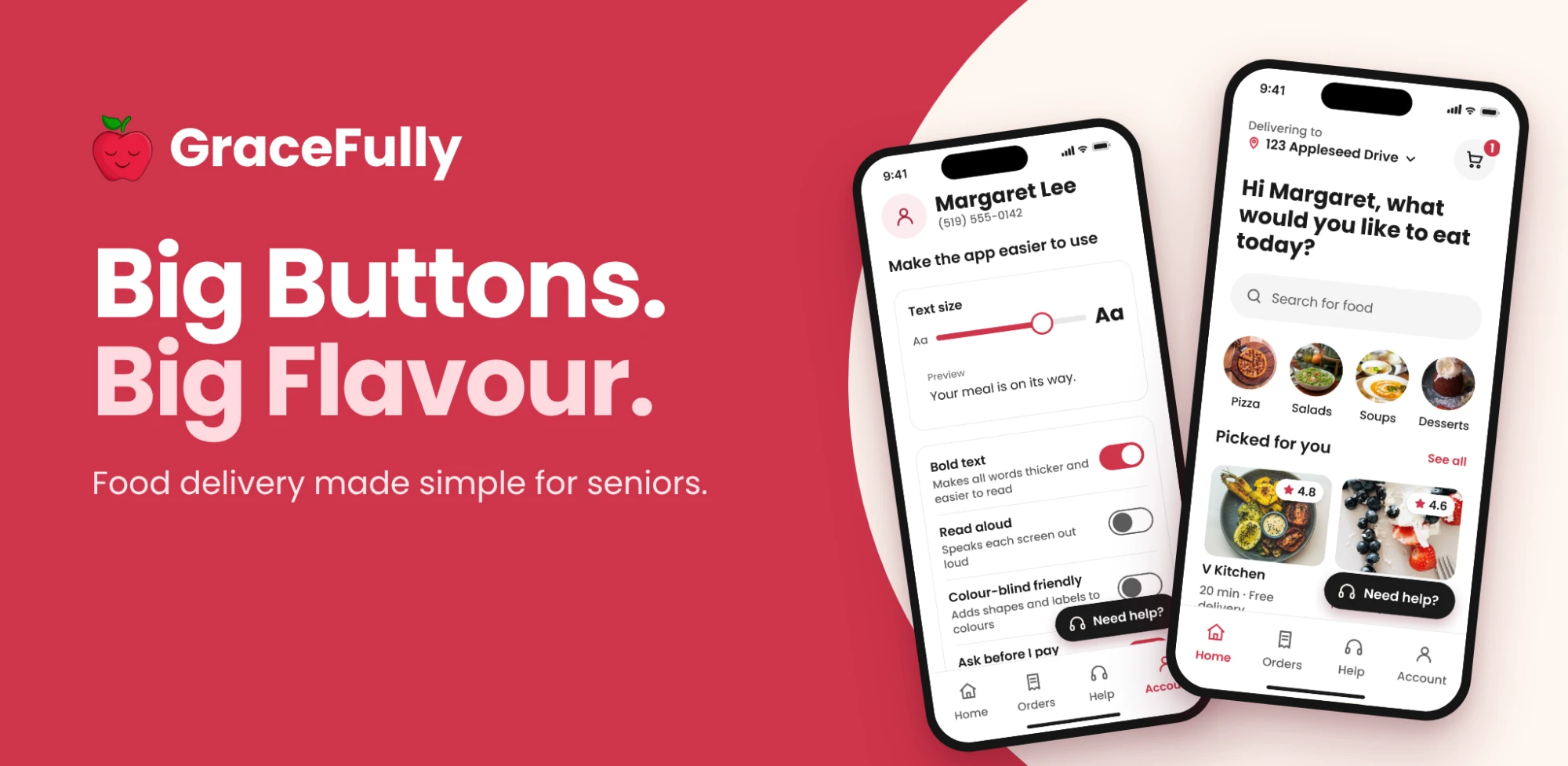
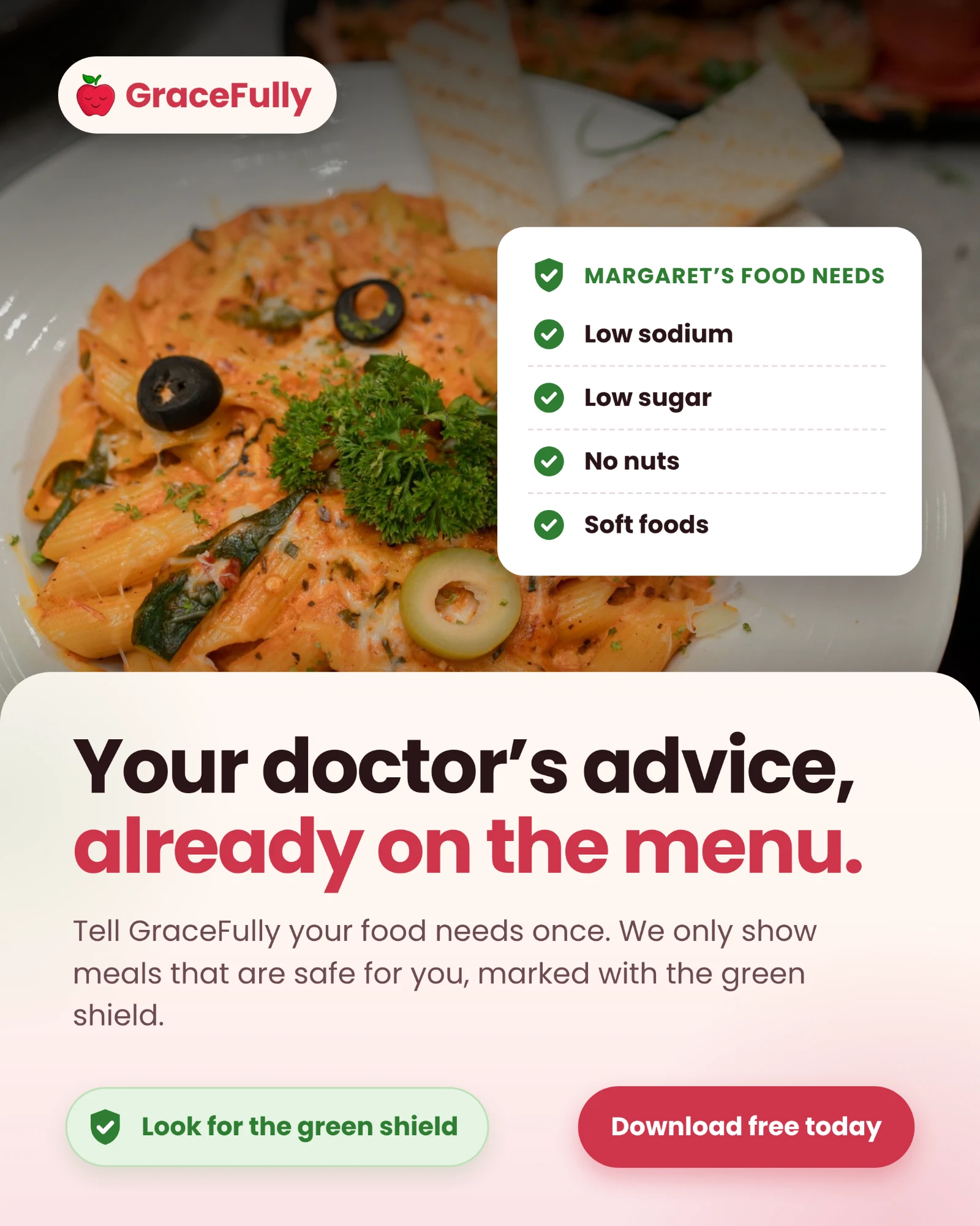
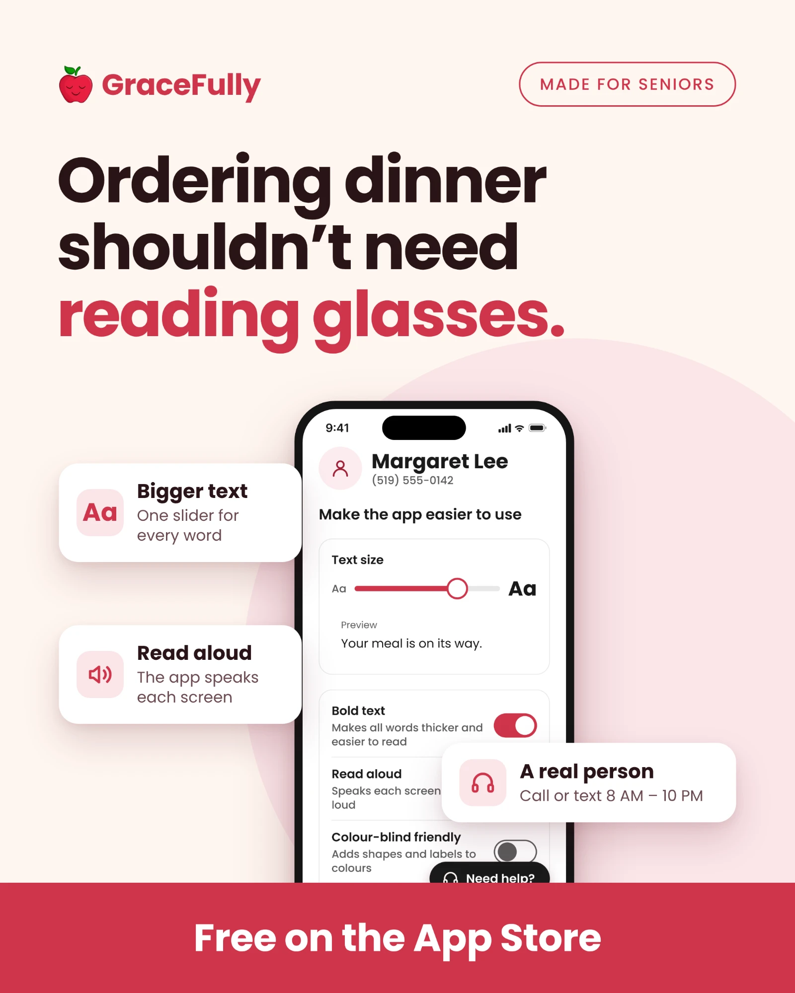
Final prototype
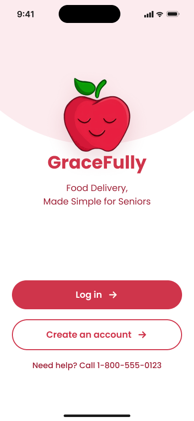
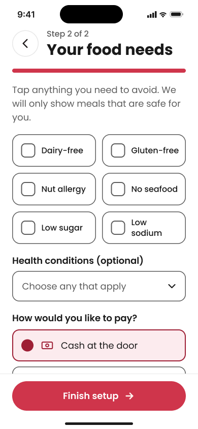
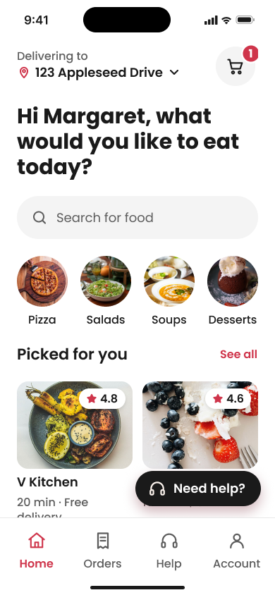
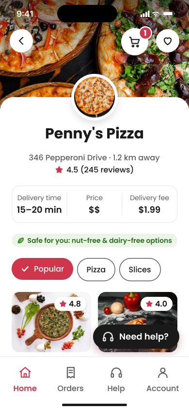
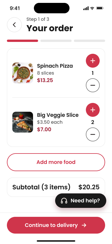
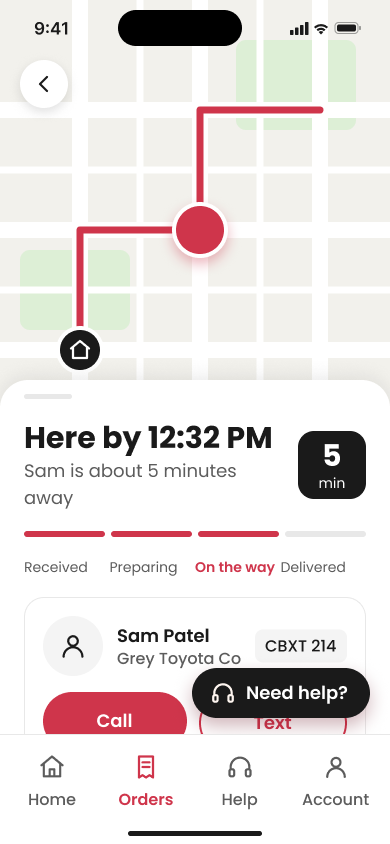
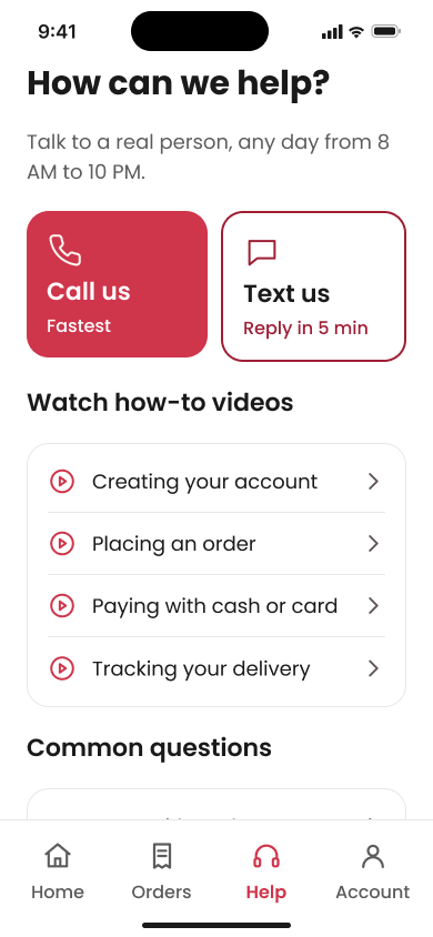
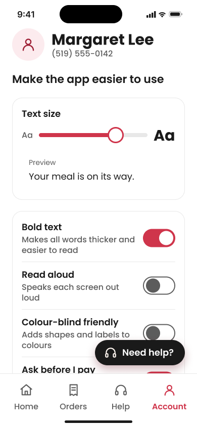
A quick note: I made this project on my own, so not every button in the prototype works. I focused on the checkout process, so that’s the part you can click all the way through.
Designed for Accessibility
Large text & buttons
Text and buttons are big enough to read and tap without squinting.
High contrast
I checked the colours so text always stands out from its background.
Simple navigation
Four tabs at the bottom: Home, Orders, Help and Account.
Clear feedback
After each step, the app tells you in plain words what happened.
Reflection
GraceFully was one of my first projects, and it’s something I’ve kept coming back to and building on over time. It pulled together a lot of different skills for me, from sketching logos on paper to making the brand board, the app screens and the ads, so I got to play around with a bunch of different software along the way. I thought it was cool to design for a more niche group like seniors and think about the accessibility needs and restrictions they might deal with every day. I also loved getting to design the whole thing from start to finish.
Honestly, Figma gave me a lot of trouble. There were so many tutorials and so many questions asked, and it’s still a software I’m learning and getting better at. But through all of it, I found a deep appreciation for marketing and for tailoring design to fit different people’s needs.
If I were to change anything, I’d work on making the accessibility settings work in the prototype, like the text size slider and read aloud, and clean that part up overall.